Dumb quote of the day--Basically, I have no idea what the fuck this man is talking about Edition
...A few decades ago, if you saw a lovely spaceship on a book cover, with a gorgeous planet in the background, you could be pretty sure you were going to get a rousing space adventure featuring starships and distant, amazing worlds. If you saw a barbarian swinging an axe? You were going to get a rousing fantasy epic with broad-chested heroes who slay monsters, and run off with beautiful women. Battle-armored interstellar jump troops shooting up alien invaders? Yup. A gritty military SF war story, where the humans defeat the odds and save the Earth. And so on, and so forth.These days, you can’t be sure.- Brad R. Torgerson, "SAD PUPPIES 3: The unraveling of an unreliable field"
Riiiiiiiiiiight--
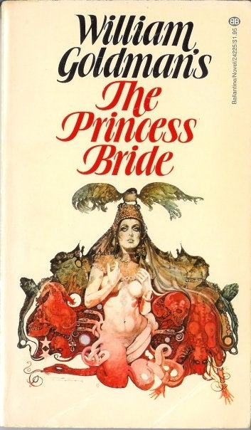
I have that particular edition of Princess Bride on my bookshelf by the way, and read it a couple of years before the movie came out; yes, it's that Princess Bride, the one with Wesley and Buttercup and Inigo Montoya and the Six-Fingered Man and the Cliffs of Insanity and "Mawwiage" and "Have fun storming the castle!" The book is a bit different from the film--it's a send-up of all those great 19th Century epic novels by the likes of Hugo, Dumas, Melville et al. wherein one finds dozens of pages of rousing adventure filled out by hundreds of pages of interminable essay-like passages about architecture and fish, and the book's message ends up being "Life Isn't Fair" instead of "True Love Prevails" or whatever. But it's not nearly as different as the Ballantine paper cover from the '70s might lead you to believe; no snake-humping nekkid ladies, for instance, an absence shared by book and film.
This was on my parents' bookshelf. I must have been in junior high school. My literary precociousness as a reader was inversely proportional to my sexual precociousness, so I grokked Goldman's satire and enjoyed the book despite the contents having nothing at all to do with the obvious reason I must have pulled it off the shelf when I didn't think the 'rents were watching.
Anyway, it's what comes to mind reading Torgerson's blog entry, though it can't even be the best example. Honestly, if there are two literary genres most notorious for false and misleading advertising on the covers, it's got to be Science Fiction and Fantasy. And this isn't a new thing. Go into your local used bookstore and find the shelf where they've stashed the SF/F paperbacks published from the tail of the '50s to, oh, the mid '70s, say, and study the covers. You'll have no idea what's going on in half of them.

I mean, what the hell is that? I'm pretty sure it's probably Ian Miller, whose work I adore, but what the hell are you getting when you crack the spine?
I haven't read The End of Eternity, so maybe it really is about... about... can someone tell me what this one's about? I'm mostly wondering about the giant ball:
I haven't read The End of Eternity, so maybe it really is about... about... can someone tell me what this one's about? I'm mostly wondering about the giant ball:
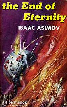
[EDIT, 4/2/15: So apparently this one's a bad example. See the comments below....]
Okay, okay, maybe I exaggerate a little. Sometimes the cover really does let you know what you're in for. F'r'instance, yes, this one is a book about drugs:

This PKD cover, on the other hand, is possibly less helpful:
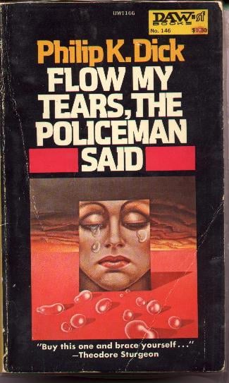
There are tears in the title and in the image, 'tis true. So... success?
Here's a book that's sitting on the nightstand because I'm re-reading it some evenings. It's an anthology by several authors working in the style of the mannered, post-Gothic cosmic horror of the primarily-featured author in the volume, and that emphasis on atmospheric, purple-yet-scholarly prose is why the cover features... a face... skull... head... with... uh... I think that's brains?... or mushrooms...?--

Also, he seems a bit miffed that something (steam? albino broccoli florets?) is squirting out his head. Which is a common reaction of Lovecraftian characters upon being brought face-to-face with cosmic horrors from the bleak abysses beyond space and time--they get a little peeved by the inconvenience of being squashed by squamous godlike non-Euclidean entities. I feel for the guy, anyway: from the look on what remains of his face, I imagine he was on his way to a job interview, or possibly getting ready for a date, when this happened. Grrr. Arrgh. Empathy, am I right? It's like having a zit pop up at the worst possible time, except with... really tiny white trees?
I could go on forever, possibly, but I'll wrap this up with the Ace unauthorized paperback of J.R.R. Tolkien's The Two Towers, featuring an artist's interpretation of the famous passage in which a Ringwraith rides his pegasus across Utah:
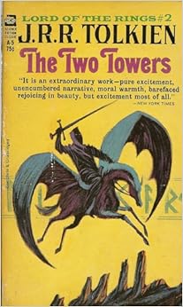
(Spoiler: he falls off just outside Provo and has to catch a bus the rest of the way. Lucky hobbits!)
(My thanks to everyone I'm stealing images from. That's probably bad form. Sorry. Thank you for taking the trouble to scan these, whomever/wherever/whenever you are.)
(h/t David Gerrold)

Comments
Thank you for that link, giltay. That really is fantastic (in so many senses of the word).
So it's a bad example of the thesis. On the other hand, it's still true that SF and Fantasy covers are notoriously poor guides to the contents.
Thank you for explaining that, however. I need to get around to reading it, I suppose....
Thomas Disch wrote "334", and the edition I have has a spaceship on the front cover.
Only it's set in New York, not even a particularly futuristic new york and no spaceships appear in the book.
Or Frank Herberts "The Godmakers" which has a naked woman in a strange baked dry landscape. Oddly enough no naked women or deserts are featured in the book.
(http://www.goodshowsir.co.uk/)